Sunday 30 August 2009

Primary, Secondary and Black and White Colours

Within this project I shall photograph the primary colours at different apertures to see if the average exposure of each is the closest match to the colours in the colour circle. I chose three subjects and took three photographs of each, altering the aperture as I went to vary the exposure half a stop brighter and darker. I once again used f/10 as my average and set the shutter speed to correctly expose the photographs at this aperture.

Colour Circle

Strawberries


55mm, 1/4sec, f/9, ISO-400


55mm, 1/4sec, f/10, ISO-400 (average)


55mm, 1/4sec, f/11, ISO-400


Yellow Rose


55mm, 1/15sec, f/9, ISO-400


55mm, 1/15sec, f/10, ISO-400 (average)


55mm, 1/15sec, f/11, ISO-400


The Sky


300mm, 1/400sec, f/8, ISO-200


300mm, 1/400sec, f/10, ISO-200 (average)


300mm, 1/400sec, f/14, ISO-200


I have found that my averages are the closest match to the colours on the colour circle apart from Blue. The Sky is a very bright blue and is slightly too bright for this project. I have photographed an unnaturally coloured blue t-shirt at the average exposure and have found this subject matches the colour circle a lot better.


55mm, 1/10sec, f/10, ISO-400


Secondary Colours

Secondary colours are a mixture of two primaries. Orange (Red and Yellow), Violet (Red and Blue) and Green (Blue and Yellow). When looking at the colour circle we can see that the secondary colours lie between the primaries that make them.

I shall take three photographs of each secondary colour the same as I did for primary. An aperture of f/10 shall still be the average.

An Orange


55mm, 1/8sec, f/9, ISO-400


55mm, 1/8sec, f/10, ISO-400 (average)


55mm, 1/8sec, f/11, ISO-400


Violet Blanket


28mm, 1/20sec, f/9, ISO-400


28mm, 1/20sec, f/10, ISO-400 (average)


28mm, 1/20sec, f/11, ISO-400


An Apple


55mm, 1/8sec, f/9, ISO-400


55mm, 1/8sec, f/10, ISO-400 (average)


55mm, 1/8sec, f/11, ISO-400


Within this project I have found that my over-exposed photograph of Orange, under-exposed photograph of Violet and average photograph of Green most closely match the shades on the colour circle. I struggled to find any subjects that are naturally Violet and big enough to fill the frame so therefore I had to settle for an unnaturally coloured blanket. When searching for my Orange and Green subjects I came to the conclusion that an Orange and an Apple most closely matched the colours of the colour circle.

Black, White and Grey as Colours

This project shows how black and white can become shades of grey by under or over exposing a shot. This technique can be used to lighten or darken a photograph. If black and white are not correctly exposed within an photograph it's overall result will not be an accurate capture of a scene or subject.

Black Painted Ceiling


51mm, 1/2sec, f/10, ISO-400 (average)


51mm, 1/2sec, f/9, ISO-400


51mm, 1/2sec, f/8, ISO-400


51mm, 1/2sec, f/7.1, ISO-400


51mm, 1/2sec, f/6.3, ISO-400


51mm, 1/2sec, f/5.6, ISO-400


White Painted Ceiling


51mm, 1/25sec, f/10, ISO-400 (average)


51mm, 1/25sec, f/11, ISO-400


51mm, 1/25sec, f/13, ISO-400


51mm, 1/25sec, f/14, ISO-400


51mm, 1/25sec, f/16, ISO-400


51mm, 1/25sec, f/18, ISO-400


With an aperture wider than f/9 the "Black" photographs begin to become noticeably grey. Also with the "White" photographs, after the second image I would no longer describe the scene as white; with an aperture smaller than f/11 the "White" photographs look grey and the last photograph, at f/18, even appears Black.

When looking closely at the Black photographs a slight blue hue can be seen and when looking at the White they almost appear slightly yellow. After checking the values of my Black and White images in Photoshop I ave discovered that my average captures are not true Black and White. Black should have a value of no more than 2 whereas White should be no less than 253. My average Black shows a lowest value of 25 and White shows the highest of 150. I shall have to retry this project and choose a subject with a smoother surface. I don't believe that my camera's meter was acquiring an accurate enough reading.

A photograph of true Black can only be achieved if no light what so ever reaches the camera's sensor. The complete opposite applies for true White; this can be achieved by aiming the lens at a white surface in bright sunlight and setting the camera's shutter to remain open for more than a minute with the widest aperture possible.

Saturday 29 August 2009

Colour and How to Control it

Colour has three qualities; Hue, Brilliance and Saturation. Saturation is the only quality that cannot be altered at the time of shooting a subject. Hue can be altered by applying colour filters to the camera's lens or by using different types of film. Using Tungsten-balanced film will give a blue haze to a photograph taken in natural daylight, on the other hand, using Daylight-balanced film to capture scenes lit by Tungsten lights will give a strong orange cast. Altering the White Balance on an advanced digital camera will also change the Hue of the colours within the photograph. The Brilliance of a subject can be altered by either over-exposing or under-exposing the image, however, doing so may result in loss of detail of some objects. All three qualities can be altered later using an image editing software such as Adobe Photoshop.

Within this project I shall alter the aperture of my camera's lens to see how it effects the colour of my chosen subject.


42mm, 1/2sec,
f/8, ISO-400


42mm, 1/2sec,
f/9, ISO-400


42mm, 1/2sec,
f/10, ISO-400 (average)


42mm, 1/2sec,
f/11, ISO-400


42mm, 1/2sec,
f/13, ISO-400


With my camera solid on a tripod, I positioned a bunch of flowers in front of the lens. My subjects of choice were a pair of Gerbera, these flowers are very large and bright red. Filling the frame as much as possible whilst preserving the most appealing composition I found the average exposure setting. At f/10 I needed to set the shutter speed to 1/2 a second in order to correctly expose the photograph. I then decreased the aperture by half a stop twice, captured each image, set the lens back to f/10 and increased the aperture by two half stops, capturing an image each time.

As well as the photographs varying from over-exposure to under-exposure the flower appears much brighter at f/8 than it does at f/13. This technique can be used to make subjects appear brighter or darker than they actually are. During the processing of the photographs, areas that are too light or dark can be darkened or lightened. In digital photography, multiple shots of the same image at different exposures can be merged together using photo editing software to lighten or darken specific areas.

Whilst placing my cursor of the lightest image in Adobe Photoshop, I can see in the "Info" panel that it has a much greater presence of blues and greens than that of the darker image.

Had there been a background to the shot there would also be a noticeable difference between the first and last shots. In the first shot the background would have been very out of focus and in the last shot it still would have been blurred but not by quite as much.

Friday 28 August 2009

4: Colour

"Aim: To help understand the basic properties of colour, to learn how to control, alter and modify them in photography and to use them as an element of design"

Colour functions as an element of design in photographs as much as tone or lines but it works in a different way. We all respond to colour uniquely; when used in certain ways it can evoke strong responses, both physically and emotionally. Learning to use colour well gives a photographer much more control over their photographs. Certain colours are associated with specific conditions, orange with warmth, blue with cold, red with passion or danger. I am looking forward to learning more about how to use colour in my photographs and how it can be controlled or manipulated to achieve the best results.

Thoughts and Feelings

The aim of “3: Elements of Design” was to help me understand and use the basic principles of graphic design in photography.

Whilst completing Elements of Design I have learnt about some of the different graphic elements of photographs, these are:

  • Points
  • Real and Implied Lines
  • Real and Implied Curves
  • Real and Implied Shapes
  • Rhythm
  • Pattern

Points are useful as they attract a viewers attention directly to a specific area of a photograph. With multiple points, the viewers eye travels between them, alternating between one and the other. Using real and implied Lines and Curves can help in directing a viewers attention in specific directions across a photograph. Real and implied Shapes add interest. Certain shapes such as equilateral triangles have proven to be aesthetically pleasing. Rhythm is the repetition of a motif or formal element at regular or irregular intervals. A viewers eye will follow a recurring rhythm or pattern of a beat or accent through a photograph.

Thursday 27 August 2009

Applying the Elements of Design

For this project I chose to focus on fruit and vegetables due to their large range of shapes, sizes and colours.

Single point dominating composition
The point being the stork of an apple

Two points
The two points being two apples

Several points in a deliberate shape
Apple, Orange and Lemon in a triangle

Vertical and Horizontal lines
Raspberries vertical and Blueberries Hoizontal

Diagonals
Sliced cucumber composed to create diagonals

Curves
The natural curvature of Bananas makes them perfect for portraying curves through the frame

Distinct Shapes
Triangular strawberries laid out in a circular shape

Two kinds of triangle
Triangular strawberries laid out to create another triangle

Rhythm
Lemons and tomatoes undulating diagonally through the frame

Pattern
Sliced Orange laid out in a circular pattern

Wednesday 26 August 2009

Rhythm and Pattern

Rhythm and Pattern in photography are created when captured subjects have a repetitive theme. The difference between them is that rhythm is to do with movement across a picture/the movement of the eye through a picture, while pattern is a static image of repeating subjects that appear to have no end to the repetition.

Rhythm
A Radiator
55mm, 1/2sec, f/14, ISO-800

I have chosen a radiator for my first subject as it clearly conveys a rhythm. As the undulating curves pass from left to right, the eye follows the beat through the photograph.

Pattern

Sliced Fruit on a light box
55mm, 1/2sec, f/10, ISO-200

For my second image, I placed slices of fruit onto a lightbox. The pattern I have created appears to continue outside the boundaries of the frame.

Thursday 20 August 2009

Dunham Massey Park


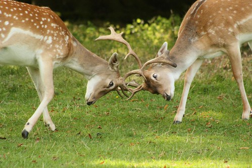
Today I took a visit to Dunham Massey. The weather was excellent, the sun was shining and I'd heard there were free roaming Deer to be found within the Park's walls, I just had to see it for myself.

Dunham Massey Park, formerly the home of the last Earl of Stamford has been owned by the National Trust since 1976. Dunham Massey was historically in the county of Cheshire, but since 1974 has been part of Trafford Metropolitan Borough, the nearest town is Altrincham.

The park is mostly “pasture-woodland or park-woodland” (a semi-natural wood) and has been since the Middle Ages. It consists mainly of ash, birch, and rowan, with a wetland habitat and several marl pits. The pits have now have flooded and formed ponds. The reserve spans 192.7 acres and provides a habitat for many animals, including fallow deer, foxes, rabbits, squirrels, fifty seven species of bird and over five hundred species of insect. Dunham Park is the only place in the northwest of England with such a concentration of old trees, and one of only a few remaining in England, making it a site of national importance. I shall definitely be visiting again, but next time I'll take spare batteries and memory cards!

To see more of the Photographs I took today please visit the set on Flickr at: http://www.flickr.com/photos/36198098@N03/sets/72157622088962860/

And to find out more about Dunham Massey, please visit the National Trust website at: http://www.nationaltrust.org.uk/main/w-vh/w-visits/w-findaplace/w-dunhammassey.htm

Dunham Massey (Shown within Greater Manchester)