A colour accent is a small point of colour within a photograph. All though the point is only small, if its colour is significantly different from the rest of the image it will demand the viewer’s attention. This works best with contrasting or complementary colours however an accent of a similar colour to that of the background will still draw the viewer’s eye towards it.
This photograph is of the right hand indicator of a Hyundai Getz. I placed the orange point in the right hand and upper third of the frame as I felt this was the most aesthetic position.
The subject for this photograph was a Beef Tomato. I took the original photograph in landscape and cropped this section as I felt it improved the composition and gave the accent a more dominating effect. The natural curves of the tomato point towards the complementary accent which helps to keep a viewer’s eyes settled upon it.
Tomato Original: Crop indicated

Complementary Colours
These are colours which are opposite each other on the colour wheel; when mixed together they create a grey and when placed next to each other, they make each other appear brighter. I found it very difficult to come across naturally occurring orange/ blue and violet/yellow combinations. Green appears to be the most abundant naturally occurring colour and therefore was much easier to find red/green combinations.
The complementary pairs are red + green, yellow + violet and blue + orange.
Admittedly the yellow now appears more orange in the final printed image. I spotted this amazing sunset and just had to capture it for this assignment. The triangle in the centre created by the two trees leads the eye towards the yellow at the bottom of the image. As yellow is a much brighter and overwhelming colour than violet, the trees have blocked most of it from sight creating a very calm, aesthetic and pleasing photograph.
To create this image I mixed some blue food colouring with water in a bowl, placed a pane of glass over the top, sliced an orange and placed it in what I felt to be the most interesting position. When look at this photograph I find my eyes spiral up the orange slices and settle upon the centre of the top slice. The lines in the top slice draw the eye towards its centre and the curves created by the peel drag it from left to right around the orange.
Original Photograph: Crop indicated

Contrasting Colours
These are colours which are a third away from one another on the colour wheel.
There are six contrasting pairs and these are red+ yellow, yellow + blue, blue + red, orange + green, green + violet and violet + orange.
I took this photograph of a Rapeseed field back in May whilst I was out cycling along the Trans Pennine Trail. After struggling to find naturally occurring blue and yellow subjects I remembered about this photograph and decided to use is as part of the assignment. Green is also present within the image, it is similar to yellow and blue whilst being much darker than them both. This allows the other colours to stand out more and remain the main colours of interest. There is around twice as much blue as there is yellow, this makes the image pleasing to look at. Yellow is a much brighter colour and therefore less is required in order for a photograph to appear balanced.
The subject here is the roof of a neighbour’s house. The synthetic red tiles highly contrast with the natural blue sky.
The warm hue of the berries greatly contrasts with the lower temperature of green. With orange being slightly brighter than green, having slightly more of the green leaves visible within the photograph creates a more pleasing appearance.
Original Photograph: Crop indicated

Similar Colours
These are colours that can be found next to each other on the colour wheel. Within photographs neither colour tends to stand out more than the other as they are similar in brightness.
This photograph of a sunflower against an orange background appears warm and may be pleasing to the eye but would look better had the background been a complementary or contrasting colour. The similar hues merge the subject and background which doesn’t give a viewer much to focus on.
Within Manchester there are many modern buildings with green and blue glass. I came across these two together, felt that they were interesting and wanted to use them for this assignment. Green and blue are very similar in brightness and neither one should stand out more than the other but in this case the green building is casting a shadow onto the blue making it much darker and increasing the viewers focus onto the green.
Green and yellow are next to each other on the colour wheel meaning they are similar, however it is hard to find situations where there are at a similar level of brightness. On the subject that I decided to use the yellow is much brighter than the green making them appear to contrast.
I decided to use similar subjects to portray this combination of similar colours but change the way in which I displayed them. My subjects of choice were red and orange peppers. I chopped the orange pepper to create a background and placed the red pepper on top. We can see that neither the red nor orange appear to stand out more that one another. The green stem on the red pepper seems to have become the main point of interest as is strongly contrasts with the orange and red.
Tutor Feedback
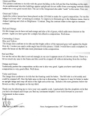
Please click on the images to view Tutor Feedback for this Assignment.
Page 1 Page 2
Amendments
Upon receiving feedback from my tutor I took note of his advice and have edited some of my photos accordingly.
Below is a list of the affected images and the advice my tutor gave for each:
- Orange on Blue – Clone out the white spots on the lower left of the indicator
- Red and Green – Re-focus on the berries
- Violet to Yellow – Crop off some of the trees on either side or create a portrait version
- Orange and Yellow – Trim off the dark area at the top LH corner to improve composition
- Green and Yellow – Increase contrast
- Blue and Yellow – Re-take using a telephoto lens to make the house on the RH side more prominent
- Red and Blue – Crop off some of the sky and increase the red
- Violet and Green – Crop off some of the RH side and the light area at the top. Possibly make an upright version. Include more greenery below the flowers so they appear on the top third
During the completion of my amendments I will re-post only the affected images.
Colour Accent - Orange on Blue Amended ISO-200, 205mm, 1/160sec, f/8
Complementary Colours – Red and Green Amended ISO-400, 55mm, 1/60sec, f/8
Complementary Colours - Violet to Yellow Amended (Portrait) ISO-400, 49mm, 1/25sec, f/9
The original shot was landscape and it appeared too cluttered with the trees on either side of the shot. To improve the shot I cropped a portrait version from down the centre.
Similar Colours – Orange and Yellow Amended (Portrait) ISO-400, 40mm, 1/30sec, f/5
Similar Colours – Green and Yellow Amended ISO-400, 53mm, 1/80sec, f/6.3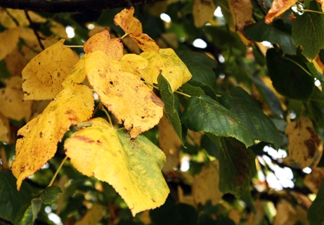
Contrasting Colours – Blue and Yellow Amended (Portrait) ISO-400, 18mm, 1/125sec, f/22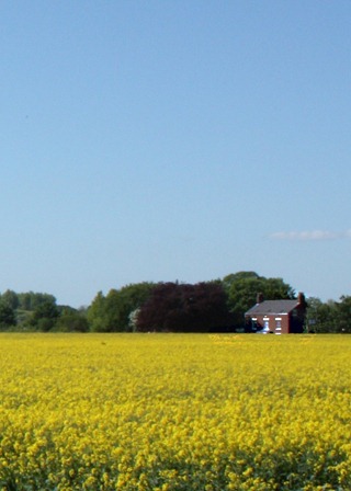
Contrasting Colours – Red and Blue Amended ISO-200, 190mm, 1/800sec, f/8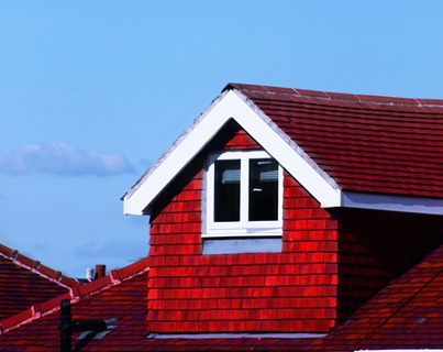
Contrasting Colours – Violet and Green Amended (Portrait) ISO-400, 55mm, 1/80sec, f/6.3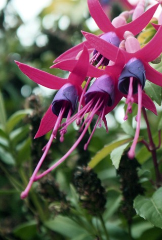
Amendment Summary
During the completion of my amendments I re-posted only the affected images.
Below is a list of the affected images and the improvements I made to each one:
- Orange on Blue – I have cloned out the white spots on the indicator
- Red and Green – Unable to find a holly bush with berries on in July, using Photoshop, I used Unsharp Mask on the three closest berries
- Violet to Yellow – I cropped a portrait version from down the centre of the original photograph
- Orange and Yellow – I cropped the dark area off the left hand side and some of the orange from the top of the image
- Green and Yellow – I increased the contrast
- Blue and Yellow – I returned to the field but the rapeseed was no longer there so I cropped a portrait version from the original shot to concentrate more on the house on the right hand side
- Red and Blue – I cropped a lot of sky off and increased the vibrance of the Red using Photoshop
- Violet and Green – I simply cropped a portrait version from the original. I placed the Violet flowers so that they take up approximately a third of the image.
Overall I feel I have followed my tutor’s advice quite well and have managed to improve the shots that needed amending.


