The aim of this assignment was to capture eight photographs of the same subject, each in a different light. Out of the eight shots, the physical properties of Shape, Form, Texture and Colour all had to be portrayed.
For each shot I had my camera sat on it's tripod and used a cable release to eliminate camera shake.
The best way to portray shape of any subject is to light it from behind and create a silhouette. My photograph clearly shows the shape of a female figure.
To light this shot I placed my external flash unit behind my subject and aimed it at the white background. Holding my flash meter against the background I was able to expose the shot so that the background was perfectly white and the statue can be seen as a silhouette.
My second silhouette shot was again lit with my external flash, however, this time I placed a rolled up piece of black card on the unit to concentrate the light into a specific location. As before I used my flash meter against the lit area of the background to expose it correctly.
This is one of my favourite shots as for a very simple technique it creates a lot of contrast. The circle of light nicely frames the top half of my subject, instantly drawing a viewers eyes to this area.
Form is the 3D (three dimensional) property of a subject. This quality is most visible when a subject is lit from one side by an undiffused light source and an absorber is placed on the opposite side.
Once again I used my flash unit, this time though I placed it on the left hand side of my subject, slightly in front of it and aimed directly at it. Placing an absorber on the opposite side increases contrast by minimising the amount of light that is reflected back towards the subject. I used a piece of black card as an absorber and placed it on the right hand side, just out of the frame.
After using flash three times I decided to try different forms of lighting.
For this shot I placed a candle on the right hand side of my subject. Because candlelight is very weak, a slow shutter speed was needed to ensure correct exposure. This technique works perfectly to depict Form as the weak light ensures minimal reflection back onto the statue from the opposite side. The high contrasted shows the subject has depth and we can clearly see that it is three dimensional.
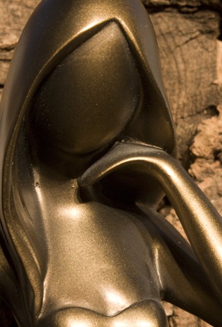
I used a 60watt Tungsten lamp to light this shot.
To emphasize my subjects smooth texture I decided to use a rough piece of bark as the background. Lighting the subject from above and slightly in front created a lot of contrast on the bark. Lots of small shadows show how rough it is. This drastically contrasts with my subject, therefore showing it has a smooth texture.
I took this shot outside, the sky was overcast but quite bright.
My idea here was to show that even though my subject has a smooth texture, it isn't completely smooth. When placed against a white tile we can see that the surface of the statue is slightly bumpy.
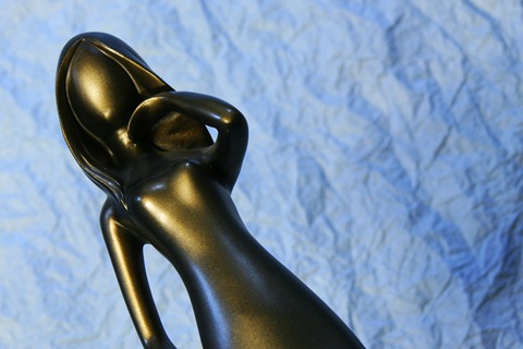
Colour – Fluorescent – Cold, Blue
Under fluorescent light with the white balance set to tungsten the captured image appears with a blue haze. I produced this image to create a feeling of coldness using colour.
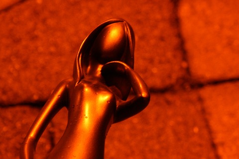
Colour – Vapour lamp – Warm – Orange
For my second colour shot I did the opposite of the first. Under a vapour street light I set my white balance to fluorescent to create this very orange and warm feeling shot.
It was very hard to focus this shot in the low light conditions.
On completion of this assignment I feel I captured some interesting shots that portray the four characteristics of shape, form, texture and colour nicely. I struggled with the texture shots but feel I have produced some adequate results.
Tutor Feedback
Overall Comments
Hi Michael,
Thank you for sending in your fourth assignment. You have produced a very interesting set of images all of the same subject but using different lighting techniques which is exactly as the assignment requires. The print quality is very good and the assignment has been very well executed.
Feedback on assignment
Form – Flash from side.
As a technical exercise (which all the images are in this assignment) this image is very good indeed. The background is nicely out of focus, thus concentrating the viewers eye on the subject. You don’t say what aperture you used, but if you had used the widest aperture this effect would be more pronounced.
Form - Candlelight.
The subject on this one is nicely placed within the frame and even though you have only used one candle you will notice there is still separation between the subject on the dark side of the subject.(left hand side)
You will also notice that the color cast is warm because of the lower color temperature of the light source.
Colour – Fluorescent – Cold, Blue
This one does what it says in the title, but the subject is not as sharp as it could be. The camera has focused on the background which is nice and sharp. In this case the subject has been laid on the background and it is better to have some distance between the background and subject.
Colour – Vapor Lamp – warm – orange
Again on this image the same comments apply. The subject is not as sharp as the background. Try using white background paper and place a colored gel over the flash gun. A toffee paper from Cadburys Roses or
Shape – Flash
I like this one as it clearly defines the shape of the subject against the white background while at the same time there is detail in the side of the subject. Well done.
Shape – Concentrated Flash
As you say in your notes this is one of your favorite shots and I agree with you. The rolled up card has acted like a snoot to concentrate the light on the background to simulate a spotlight. Excellent.
Texture – Rough Contrast
As you say in your notes the subject has a smooth texture, particularly in the face area. Again the subject is nicely placed within the frame to give a nice simple composition and the tungsten lamp has given a nice sepia effect.
Texture – Smooth Contrast
This time the texture in the subjects face appears to be less smooth than the previous example and this is a very good indication as to what can be achieved by trying out different lighting techniques. Another good image, but the subjects head has been cropped off. Either include the head or do a more severe crop as in the previous shot, then it doesn’t look as though its accidental.
Other
Thank you once again for allowing me to comment on your work and you have completed this exercise in a very competent manner. I now look forward to your next assignment in due course. In the meantime I will return your prints in the post.
Amendments
Upon receiving feedback from my tutor I took note of his advice and have edited some of my photos accordingly.
Below is a list of the affected images and the advice my tutor gave for each:
- Colour – Fluorescent – Cold, Blue – Re-take shot with the subject further away from background
- Colour – Vapour Lamp – Warm, Orange – Again re-take with the subject further away from the background
- Texture – Smooth – Crop more severely to improve composition
- Texture – Rough – Again crop more severely to improve composition
During the completion of my amendments I will re-post only the affected images.
Colour – Fluorescent – Cold, Blue Amended ISO-200, 72mm, 1/6sec, f/5.6
Colour - Vapour Lamp – Warm, Orange Amended ISO-400, 88mm, 3.2sec, f/5.6
Texture – Rough Contrast (Portrait) Amended ISO-100, 55mm, 3sec, f/16
Texture – Smooth Contrast (Portrait) Amended ISO-200, 43mm, 1/2sec, f/5.6
Amendment Summary
During the completion of my amendments I re-posted only the affected images.
Below is a list of the affected images and the improvements I made to each one:
- Colour – Fluorescent – Cold, Blue – I re-took the shot with the subject further away from background
- Colour – Vapour Lamp – Warm, Orange – Again I re-took the shot with the subject further away from the background
- Texture – Smooth – I cropped the original shot severely to improve composition
- Texture – Rough – Again I cropped the original shot severely to improve composition
Overall I feel I have followed my tutor’s advice quite well and have managed to improve the shots that needed amending.
![4487095249_2ae076d5b7_b[1] 4487095249_2ae076d5b7_b[1]](https://blogger.googleusercontent.com/img/b/R29vZ2xl/AVvXsEjD-2ilZ_wbGmwUD1NczgSpWKbLIWtu_3AqpaCcV_rx0h0_KbgFJbu15n345vMCx4EYk3R0jZ1cQ_xjBusgy8CvJkyXcO7Wzl9I2caJd8VDqYdmnDnJuFnLbbmfJeedBbht1BPNj7pdzFM/?imgmax=800)
![4487097313_aca50a6e21_b[1] 4487097313_aca50a6e21_b[1]](https://blogger.googleusercontent.com/img/b/R29vZ2xl/AVvXsEhzFbnoW0LAyWiDO3F-spnJQJY-pWX68BhCCDE2Hms_ojl3Qvnp3Y761GLb-1bJSj7eRW0H1o8lR-xO5oWZeAATDtjEY7MGxfBEjqSczZ-BZPVaOi2RbCTSXV6M1Bjlnm3fotcvBHEC2DM/?imgmax=800)
![4487739564_edc6935447_b[1] 4487739564_edc6935447_b[1]](https://blogger.googleusercontent.com/img/b/R29vZ2xl/AVvXsEjiKDdCrpx_QwdAdj_ZKJqPRCr01ruzjivTaIfsmSAts0szD5zZSLZRn99yMOh7R-JJ1D-HRu1P_eKzIVp_cNBcTeh6Ad9hicmZhBzA5zOBFiEoZVnCsoYjL_Ernt7206BGMd9rTRxcmB8/?imgmax=800)
![4487093635_b3dc078531_b[1] 4487093635_b3dc078531_b[1]](https://blogger.googleusercontent.com/img/b/R29vZ2xl/AVvXsEjGznf_w_j_LXfBdFtnK1QtUWUPhS2Lme-eRRaT4CTitzl4J6WHqBtgp_AJ4WrZv16D1s0wJX5KH7kC0Wykx-b99_2rAa2IhkulO61LbPxwotwX_FYFS-bUXDaZrBzj79rLft9RS4piRWc/?imgmax=800)
![4487752942_98483171b0_b[1] 4487752942_98483171b0_b[1]](https://blogger.googleusercontent.com/img/b/R29vZ2xl/AVvXsEhNJ-Yj9er76rhDpv_uJrvZthm4WU9jePnpSFO-nhhtVeIDbhJFToQnLkYaxJFbRhPW4jxEiGWpRwt55rLr_DolEILlgsh-8UxVYNd0nX1vk9BoGW3mzYaJuoZPCgMsiSw-w1kpNNGpXHY/?imgmax=800)
![4526582126_4a801aefd4_o[1] 4526582126_4a801aefd4_o[1]](https://blogger.googleusercontent.com/img/b/R29vZ2xl/AVvXsEhiJBN1eRq9zdeB7plWUqcNsMJW8JZwiFk7Dl7t9e7VD5TSUC1IhgYdQecTIIi09run59l_qT3k7dxWEzw-0h8LmfGqqPXg_7b7ITlKTasG03VwtaYnMYrmP5oF_-UrX73D9X2hsF8YdeI/?imgmax=800)
![4526653680_2c37158d4d_o[1] 4526653680_2c37158d4d_o[1]](https://blogger.googleusercontent.com/img/b/R29vZ2xl/AVvXsEjY4WtQqzeHTQOP0hjaQ3V63kEkR4hGhw-ermWwqWeyEXro8Lwn5Y8j7yNFNfYzWqqni-QxDSLJPptu_JaWRWlcwPS_TFnfMVXCJuV88LCCXbqLRhUEGazQ7IZk9NpkVsAmJrtw63N816E/?imgmax=800)
![4515712305_eed799761a_b[1] 4515712305_eed799761a_b[1]](https://blogger.googleusercontent.com/img/b/R29vZ2xl/AVvXsEgKWZG9GFACOUtiG_47NDIsTHU3iJ_1shTByBasomsXpjXn3jQi-5mUQc_a3h-vhehYINuM8rTKau-QARGfZj_gGAmo5-qpMO7klR5IM210jpF9EU4F2NscZo8UTyM8Qg7C1GJJDgh1gXQ/?imgmax=800)