Sunday, 27 September 2009

5: Natural Light

"Aim: To show the variety of outdoor light, how to make the best use of it and how to choose appropriate lighting conditions for particular subjects"

Light can be used deliberately to bring texture and atmosphere to a photograph. Without light, it would not be possible to even take photographs and therefore is the most important element of photography. The quality of light can make the all important difference to a picture. It changes significantly and scenes can appear differently every single day. Knowing how to choose or control light is a major step in improving photographs. I am looking forward to learning how to use light to improve my photographs.

Below I have selected twelve photographs from The Textbook that are lit from the four different lighting angles; Front Lit, Back Lit, Side Lit and Rim Lit.

Front Lit:

01. Image 81, Page 151: ‘White Branches’ Ansel Adams

1

02. Image 45, Page 95: ‘Miss Thompson’ Alfred Stieglitz

2

03. Image 49, Page 95: ‘Der Malshirm (The Artist’s Umbrela)’ Heinrich Kuehn

3

04. Image 9, Page 21: ‘The Open Door’ William Henry Fox Talbot

4

Back Lit:

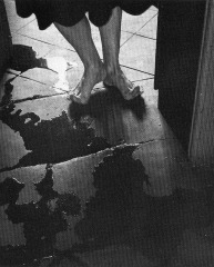
05. Image 119, Page 220: ‘El Umbral (The Threshold)’ Manuel Avarez Bravo

img005

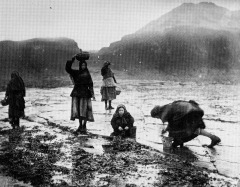
06. Image 39, Page 71: ‘Flither [Limpet] Pickers’ Frank Meadow Sutcliffe

img006

Side Lit:

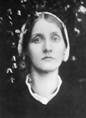
07. Image 21, Page 39: ‘Portrait Head of a Woman’ Julia Margaret Cameron

img007

08. Image 40, Page 82: ‘Wilbur Peebo – Comanche’ Edward Curtis

img008

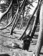
09. Image 44, Page 87: ‘The Pines of Mio’ Herbert G. Ponting, F.R.G.S.

img009

Rim Lit:

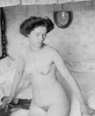
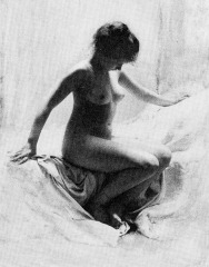
10. Image 48, Page 93: ‘Académie’ Robert Demachy

img010

11. Image 107, Page 195: ‘Threshing Corn in Sicily’ Gotthard Schuh

img011

12. Image 35, Page 633: ‘Recruiting Sergeants at Westminster’ John Thomson

img012

Another part of Project 45: Picture Count is to “identify 10 photographs from the textbook in which lighting is of prime importance”. I may be over thinking this slightly but without light then photography wouldn’t exist at all and therefore, I believe light is the most important factor in any photograph! However, I have listed 10 shots below where the specific light condition is the most aesthetic quality.

01. Image 119, Page 220: ‘El Umbral (The Threshold)’ Manuel Avarez Bravo

02. Image 64, Page 117: ‘A Teazel’ Albert Renger-Patzsch

03. Image 84, Page 156: ‘Greene County Georgie’ Jack Delano

04. Image 103, Page 89: ‘A Public Meeting in Estremadura’ David Seymour

05. Image 122, Page 224: ‘Edith. Danville, Virginia 1971’ Emmit Gown

06. Image 35, Page 63: ‘Recruiting Sergeants at Westminster’ John Thomson

07. Image 44, Page 87: ‘The Pines of Mio’ Herbert G. Ponting, F.R.G.S.

08. Image 48, Page 93: ‘Académie’ Robert Demachy

09. Image 114, Page 207: ‘Crosses on Scene of Highway’ Robert Frank

10. Image 115, Page 209: Untitled, William Klein

Monday, 21 September 2009

Thoughts and Feelings

The aim of “4: Colour” was to help me understand the basic properties of colour, to learn how to control, alter and modify it and to use it as an element of design.

During this set of projects I have learnt how to use colour to influence the way in which a person views my photographs. Certain colours will give a viewer a sense of specific feelings and emotions. Different colour combinations create very dramatic, interesting images and can draw attention directly to the main focal point; this is extremely useful when a photographer is trying to induce a particular response. Coloured filters can be used to alter a photographs hue, so can different types of film and the use of white balance settings. In black and white photography, colour filters will lighten similar colours or darken contrasting and complementary colours, this can be very useful when the photographer feels that certain objects need to appear lighter or darker in their shots. Colour is a very important element of design as it greatly influences how we view a photograph.
Sunday, 20 September 2009

Assignment 2: Colour

Colour Accents
A colour accent is a small point of colour within a photograph. All though the point is only small, if its colour is significantly different from the rest of the image it will demand the viewer’s attention. This works best with contrasting or complementary colours however an accent of a similar colour to that of the background will still draw the viewer’s eye towards it.

Green Background with a Red Accent (A complementary colour combination)
ISO-400, 30mm, 1/13sec, f/9

After coming across this plant I decided to remove most of the berries from an area, leaving just one to leave a red accent against a green background. The leaves in the photograph create many diagonal and curved lines, the majority of which lead towards the centre of the main subject. The lines draw the viewer towards the remaining berry where the eyes settle upon the colour accent.

Blue Background with an Orange Accent (A complementary colour combination)
ISO-200, 205mm, 1/160sec, f/8

This photograph is of the right hand indicator of a Hyundai Getz. I placed the orange point in the right hand and upper third of the frame as I felt this was the most aesthetic position.

Green Background with an Orange Accent (A contrasting colour combination)
ISO-200, 50mm, 1/2000sec, f/2.8

I spotted this flower after it had fallen onto the lawn and decided it would be a great subject to capture as part of the colour accent section for this assignment. I placed the flower on the right hand side and in the lower third of the image; this is the point at which two of the lines from the golden section cross. I feel that the flower appears very pleasing to the eye in this position as it seems to face and open into the upper left section of the photograph.

Red Background with a Green Accent (A complementary colour combination)
ISO-200, 55mm, 3.2sec, f/9 (cropped)

The subject for this photograph was a Beef Tomato. I took the original photograph in landscape and cropped this section as I felt it improved the composition and gave the accent a more dominating effect. The natural curves of the tomato point towards the complementary accent which helps to keep a viewer’s eyes settled upon it.

Tomato Original: Crop indicated


Complementary Colours
These are colours which are opposite each other on the colour wheel; when mixed together they create a grey and when placed next to each other, they make each other appear brighter. I found it very difficult to come across naturally occurring orange/ blue and violet/yellow combinations. Green appears to be the most abundant naturally occurring colour and therefore was much easier to find red/green combinations.
The complementary pairs are red + green, yellow + violet and blue + orange.

Red and Green
ISO-400, 55mm, 1/50sec, f/8

Here I have captured a Holly leaf and some berries. There is a diagonal line travelling across the photograph from the bottom left corner to the top right, created by details of the plant. The diagonal draws the viewer’s eye towards the berries where it settles. There are also other lines visible in the background which helps to intensify the directing effect. Curves are usually associated with elegance and smoothness but there is a strong contrast on Holly leaves as they create sharp points, this gives the photograph a dramatic effect.

Violet to Yellow
ISO-400, 50mm, 1/25sec, f/9

Admittedly the yellow now appears more orange in the final printed image. I spotted this amazing sunset and just had to capture it for this assignment. The triangle in the centre created by the two trees leads the eye towards the yellow at the bottom of the image. As yellow is a much brighter and overwhelming colour than violet, the trees have blocked most of it from sight creating a very calm, aesthetic and pleasing photograph.

Red and Green
ISO-400, 55mm, 1/400sec, f/6.3

This photograph was taken at Salford Keys in Manchester. The main colours with in the image (red and green) are complementary, however it also contains a very light blue in the background. Blue and green are similar colours whereas it contrasts with red. The fact that the blue is very light makes it almost appear neutral and allows the complementary combination of red and green stand out as the main subjects of interest.

Orange and Blue
ISO-400, 55mm, 1/13sec, f/9 (cropped)

To create this image I mixed some blue food colouring with water in a bowl, placed a pane of glass over the top, sliced an orange and placed it in what I felt to be the most interesting position. When look at this photograph I find my eyes spiral up the orange slices and settle upon the centre of the top slice. The lines in the top slice draw the eye towards its centre and the curves created by the peel drag it from left to right around the orange.

Original Photograph: Crop indicated


Contrasting Colours
These are colours which are a third away from one another on the colour wheel.
There are six contrasting pairs and these are red+ yellow, yellow + blue, blue + red, orange + green, green + violet and violet + orange.

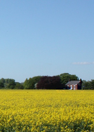
Blue and Yellow
ISO-400, 18mm, 1/125sec, f/22

I took this photograph of a Rapeseed field back in May whilst I was out cycling along the Trans Pennine Trail. After struggling to find naturally occurring blue and yellow subjects I remembered about this photograph and decided to use is as part of the assignment. Green is also present within the image, it is similar to yellow and blue whilst being much darker than them both. This allows the other colours to stand out more and remain the main colours of interest. There is around twice as much blue as there is yellow, this makes the image pleasing to look at. Yellow is a much brighter colour and therefore less is required in order for a photograph to appear balanced.

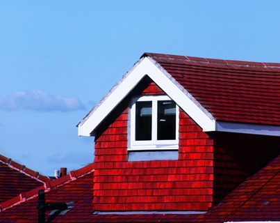
Red and Blue
ISO-200, 190mm, 1/800sec, f/8

The subject here is the roof of a neighbour’s house. The synthetic red tiles highly contrast with the natural blue sky.

Orange and Green
ISO-400, 55mm, 1/125sec, f/10 (cropped)

The warm hue of the berries greatly contrasts with the lower temperature of green. With orange being slightly brighter than green, having slightly more of the green leaves visible within the photograph creates a more pleasing appearance.

Original Photograph: Crop indicated


Violet and Green
ISO-400, 55mm, 1/80sec, f/6.3

It is extremely difficult to find violet coloured objects. I’m not 100% happy with the colour of my subject of choice however I feel it still portrays a strong contrast with the green background. The eye is definitely drawn towards the flowers opposed to the leaves of the plant as they are a much more vivid colour.

Similar Colours
These are colours that can be found next to each other on the colour wheel. Within photographs neither colour tends to stand out more than the other as they are similar in brightness.

Orange and Yellow
ISO-400, 40mm, 1/30sec, f/5

This photograph of a sunflower against an orange background appears warm and may be pleasing to the eye but would look better had the background been a complementary or contrasting colour. The similar hues merge the subject and background which doesn’t give a viewer much to focus on.

Green and Blue
ISO-400, 55mm, 1/320sec, f/6.3

Within Manchester there are many modern buildings with green and blue glass. I came across these two together, felt that they were interesting and wanted to use them for this assignment. Green and blue are very similar in brightness and neither one should stand out more than the other but in this case the green building is casting a shadow onto the blue making it much darker and increasing the viewers focus onto the green.

Green and Yellow
ISO-400, 53mm, 1/80sec, f/6.3

Green and yellow are next to each other on the colour wheel meaning they are similar, however it is hard to find situations where there are at a similar level of brightness. On the subject that I decided to use the yellow is much brighter than the green making them appear to contrast.

Red and Orange
ISO-200, 55mm, 0.8sec, f/5.6

I decided to use similar subjects to portray this combination of similar colours but change the way in which I displayed them. My subjects of choice were red and orange peppers. I chopped the orange pepper to create a background and placed the red pepper on top. We can see that neither the red nor orange appear to stand out more that one another. The green stem on the red pepper seems to have become the main point of interest as is strongly contrasts with the orange and red.

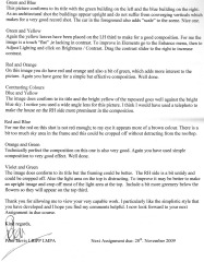
Tutor Feedback

Please click on the images to view Tutor Feedback for this Assignment.

Page 1                                 Page 2

img013 img014

Amendments

Upon receiving feedback from my tutor I took note of his advice and have edited some of my photos accordingly.

Below is a list of the affected images and the advice my tutor gave for each:

  • Orange on Blue – Clone out the white spots on the lower left of the indicator
  • Red and Green – Re-focus on the berries
  • Violet to Yellow – Crop off some of the trees on either side or create a portrait version
  • Orange and Yellow – Trim off the dark area at the top LH corner to improve composition
  • Green and Yellow – Increase contrast
  • Blue and Yellow – Re-take using a telephoto lens to make the house on the RH side more prominent
  • Red and Blue – Crop off some of the sky and increase the red
  • Violet and Green – Crop off some of the RH side and the light area at the top. Possibly make an upright version. Include more greenery below the flowers so they appear on the top third

During the completion of my amendments I will re-post only the affected images.

Colour Accent - Orange on Blue Amended ISO-200, 205mm, 1/160sec, f/8orange on blue NEW In the original shot there was a white spot on the indicator. I have cloned this spot in Photoshop out to create a more pleasing photograph.

Complementary Colours – Red and Green Amended ISO-400, 55mm, 1/60sec, f/8Berries NEW In my original shot the berries weren’t fully in focus. Unfortunately I was unable to find another holly bush that has berries on it in July. I did what I could in Photoshop and feel I’ve managed to adequately improve the shot. I used Unsharp Mask on the three closest berries.

Complementary Colours - Violet to Yellow Amended (Portrait) ISO-400, 49mm, 1/25sec, f/9violet to yellow NEW The original shot was landscape and it appeared too cluttered with the trees on either side of the shot. To improve the shot I cropped a portrait version from down the centre.

Similar Colours – Orange and Yellow Amended (Portrait) ISO-400, 40mm, 1/30sec, f/5NEW To improve on this shot I have cropped the dark area off the left hand side and some of the Orange from the top of the image

Similar Colours – Green and Yellow Amended ISO-400, 53mm, 1/80sec, f/6.3NEW green n yellow This shot is the same as the original however, I’ve increased the Contrast to improve the shot.

Contrasting Colours – Blue and Yellow Amended (Portrait) ISO-400, 18mm, 1/125sec, f/22blue and yellow NEW I initially used a very short focal length when capturing this shot. With using such a wide angle I neglected to capture a specific point of interest. I returned to the spot to take another shot using a telephoto lens, unfortunately the yellow Rapeseed was no longer there. I decided to crop my original shot to see if that would improve it. I cropped it in Photoshop and used Unsharp Mask on the house. It’s not a perfect image but it goes have a much better composition, a specific point of interest and still displays the all important Blue and Yellow colours.

Contrasting Colours – Red and Blue Amended ISO-200, 190mm, 1/800sec, f/8RED AND BLUE NEW The original shot was in portrait format, there was too much sky and the Red roof top wasn’t quite red enough. I have now created a Landscape version by cropping the original and increased the vibrance of the Red using Photoshop.

Contrasting Colours – Violet and Green Amended (Portrait) ISO-400, 55mm, 1/80sec, f/6.3purple and green NEW To improve this shot I simply cropped a Portrait version from the initial photograph. I have created a very aesthetic close-up with the flowers taking up approximately a third of the shot.

Amendment Summary

During the completion of my amendments I re-posted only the affected images.

Below is a list of the affected images and the improvements I made to each one:

  • Orange on Blue – I have cloned out the white spots on the indicator
  • Red and Green – Unable to find a holly bush with berries on in July, using Photoshop, I used Unsharp Mask on the three closest berries
  • Violet to Yellow – I cropped a portrait version from down the centre of the original photograph
  • Orange and Yellow – I cropped the dark area off the left hand side and some of the orange from the top of the image
  • Green and Yellow – I increased the contrast
  • Blue and Yellow – I returned to the field but the rapeseed was no longer there so I cropped a portrait version from the original shot to concentrate more on the house on the right hand side
  • Red and Blue – I cropped a lot of sky off and increased the vibrance of the Red using Photoshop
  • Violet and Green – I simply cropped a portrait version from the original. I placed the Violet flowers so that they take up approximately a third of the image.

Overall I feel I have followed my tutor’s advice quite well and have managed to improve the shots that needed amending.

Saturday, 12 September 2009

Coloured Filters with Black and White Photography

In this project I shall experiment with coloured filters to see how they effect tones in Black and White Photography. I have created a still life scene using fruit with a blue background. I have used fruit as I feel they have very strong, natural colours. As I don't think there is any form of food with a blue colour I chose to use a blue background.

Original Colour Version...............Black and White Version


Red Filter
37mm, 1/3sec, f/10 ISO-400

Yellow Filter
37mm, 1/4sec, f/10 ISO-400

Blue Filter
37mm, 0.6sec, f/10, ISO-400

From the photographs above we can see that when using a coloured filter, any subject of the same colour is lightened and the other colours are darkened. The darkening effect is strongest on the subjects that are complementary colours to that of the filter.

When using Black-and-White film for outdoor photography the sky will expose quite darkly on the negative and therefore light on the print; to counteract this, a Yellow, Orange or Red filter can be applied to the lens as this will darken Blue tones.


Tuesday, 8 September 2009

Styal Woods

The woods in Styal surround the National Trust Property Quarry Bank Mill.

The mill was founded by Samuel Greg in 1784 in the village of Styal on the River Bollin. Its original iron water wheel was designed by Thomas Hewes and built between 1816 and 1820.

The Hewes wheel finally broke in 1904. After that the River Bollin continued to power the mill, through two water turbines. Today the Mill is home to the most powerful working waterwheel in Europe, an iron water wheel which was originally at Glasshouses Mill at Patley Bridge. This wheel was designed by Sir William Fairbairn, the Scottish engineer who had been an apprentice of Thomas Hewes.

The estate surrounding the mill, also developed by Greg, is the most complete and least altered factory colony of the Industrial Revolution. The estate and mill were donated to the National Trust in 1939 by Alexander Carlton Greg and are open to the public. The mill continued in commercial production until 1959.

The factory was founded for the spinning of cotton and by Samuel Greg's retirement in 1832 was the largest such business in the United Kingdom. The water-powered Georgian mill still produces cotton calico.

Quarry Bank Mill400px-Quarry_Bank_Mill[1] Taken from the article about Quarry Bank Mill on Wikipedia

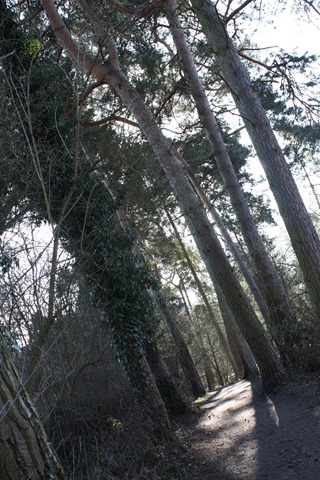
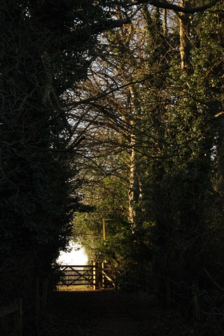
The WoodsDPP_0094

DPP_0114

DPP_0127

DPP_0147

DPP_0181